Cultured
Cultured is a mobile app that helps users log, rate, and revisit their cheese experiences. Users can scan labels or search to log, tag flavor notes, review, and explore wine pairings and serving tips. The app turns cheese tasting into a personal, organized journey.


Challenge
As a cheese lover, I often try new varieties but struggle to remember which ones I liked especially. Without a central way to log my preferences, I lose track of standout cheeses.
Key objective
Design a user friendly app that allows users to quickly and visually track their cheese purchases, flavor preferences, and personal ratings, ultimately making future decisions easier and more enjoyable.
Solution
Users can quickly scan or search cheeses, log flavor profiles, and rate them with short notes. The app includes curated pairings and AI-powered suggestions, making it both functional and inspiring not just a database.
Role
UX/UI designer
Duration
12 weeks
Tools
Adobe illustrator and Figma
Competitive Audit
To figure out what the market is lacking and how this app can provide everyone with a desirable experience I conducted secondary research through a competitive audit. I compared 4 indirect and direct competitors.

Key takeaways
There is a clear gap in the market for a cheese experience that combines accessible design with educational content, real world utility, and personalized discovery. While some platforms excel individually in areas such as offline access, and data-driven recommendations, none fully integrate these strengths into a single, seamless product. .
User Research
Interviews
I conducted interviews with participants between ages 21 and 65, all participants use social media and shop online as well as in person. Participants answered questions like...
What frustrates you most when trying to track or remember Cheeses?
Do you use any other apps or tools to help with cheese tasting? If yes, which ones?
Do you take notes or photos more often when tasting cheese?
How do you feel about social sharing features within food or tasting apps?
When exploring cheese recommendations, what UI elements help you feel confident in the suggestions (e.g., user ratings, expert notes, photos)?
One question in particular gave great insight
"Which features or app experiences would motivate you to consistently track and engage with your cheese tastings?"
“I’d love something where I can just snap a quick photo and maybe add a couple words. I don’t want to spend time typing. Also, it would be cool if the app suggested other cheeses I might like based on what I’ve logged.”
“Smart recommendations would definitely keep me coming back. If the app learns what I like and points me to new cheeses or seasonal picks, that’s a big plus. Also, easy navigation — I hate apps where it takes forever to find what I want.”
“I’m new to cheese, so curated lists or trending cheeses would help a lot. I’m not sure what to try next, so tips and pairing ideas would be super helpful. And it should be simple — no complicated steps
Some interview findings
Trends
Pains
-
User tend to do their own google search in store
-
Users do not track the cheeses they try
-
current tracking is manual and fragmented ex Notes app or camera roll
-
Users value personal logging over social sharing
Desires
-
Manual entry is tedious, users avoid logging because typing takes too long or feels like a chore.
-
Poor memory recall, users frequently forget cheese names, flavors, or what they paired it with.
-
No smart suggestions, users feel alone in cheese discovery.
-
Photos taken easily lost and forgotten in camera roll
Needs
-
A cheese app that feels modern, visual, and intuitive.
-
Quick logging, take a photo, add a short note, done.
-
Smart recommendations based on past cheeses, flavor profiles, or even moods.
-
Wine and food pairing tips integrated into the cheese view.
-
A beautiful, swipeable interface with rich visuals, like a lifestyle app, not a reference database.
-
A personal tasting journal that remembers preferences and shows tasting history.
-
Cheese discovery tools: curated lists, seasonal picks, or "similar to what you like" AI driven features.
-
Clear, minimal navigation with strong visual hierarchy and feedback (animations, confirmations, etc.).
Synthesis
Empathy Map
After summarizing the data I came up with the overall sentiments from participants and placed them into an empathy map. This data was collected from interviews, the questionnaire, casual observation and daily discussions.

User Persona

Goals
For the User
For the Business
-
Quickly log cheeses via photo or search with minimal input.
-
Track personal preferences and tasting notes over time.
-
Remember cheeses they liked/disliked and avoid repurchasing bad ones.
-
Discover new cheeses based on personal flavor preferences.
-
Organize their cheese experiences visually and intuitively.
-
Access curated recommendations or seasonal guides for exploration.
-
Use the app privately without needing to engage socially.
-
Drive user acquisition and retention through elegant UX and real utility.
-
Build a unique cheese data repository (flavor profiles, reviews, ratings).
-
Differentiate from outdated competitors with superior UX/UI.
-
Position Cheese Tracker as the “Vivino for cheese.”
-
Leverage user data (anonymously) to refine recommendation engine and generate insights.
Feature Priorities
-
Quick photo log and minimal taps to save a cheese
-
Add notes to entry with auto suggest tags like “tangy ” or “funky” with tap-based selectors
-
Favorites Scrollable card view of past cheeses loved, emphasis on photos, rating, and notes
-
Cheese Suggestions carousel of “Similar Cheeses” based on user taste, swipe-based discovery.
Tech Specs
-
Visual first Design, Prioritize photography, cards, and swipe gestures
-
Cheese images, pairing icons, and review stars should guide the experience
-
Low friction Logging, one tap photo log, little user input needed with defaults
-
Private by Default, no forced social features “for me,” not “for the crowd” but have the option
-
Accessible & Intuitive, clean typography, high contrast and higherarchy
Information Architecture
User Journey: Track a cheese

User Journey: Discover Cheese To Try

Site map

UX Design
Wireframes
Below you may view the progress from sketches to high-fi iterations of the four main pages.
Low-fi
Home Page V.1

Search Page V.1

Camera Page V.1

Discover Page V.1

Profile Page V.1

Mid-fi
Home Page V.2

Search Page V.2

Camera Page V.2

Community Page V.2

Profile Page V.2
High fi
Home Page V.3
Search Page V.3
Camera Page V.3
Community Page V.3
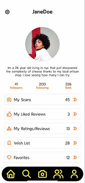
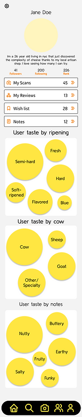
Profile Page V.3


Usability testing
After completing the initial prototype of my app, I conducted a remote usability test with four participants comprised of both friends and individuals from my original survey group. Using Zoom for the sessions allowed me to record and analyze user behavior in detail, including their navigation patterns and time spent on key actions. I focused specifically on evaluating five critical task flows to assess clarity, efficiency, and overall user experience.
Main Tasks
Task 1
Discover a Cheese Based on Taste Preferences
Task 2
Find a Cheese and Pair It with a Wine
Task 3
Scan or Identify a Cheese from an Image or Label
Task 4
Save a Cheese from recent ratings/reviews to favorites page
Task 5
Learn about a cheese you never heard of and add to wishlist
Goals
-
Identify major usability issues or breakdowns in completing key tasks.
-
Assess whether users experience confusion or friction with the app’s navigation or layout.
-
Observe which task flows feel intuitive and highlight interface elements that support them well.
-
Confirm that critical content is easy to find and appears contextually when users need it.
Quotes
I took these quotes into consideration when creating the final high mockup with corrections.
“The way things are grouped makes it easy to explore without getting lost.”
The icons and flavor tags made it really easy to find something I’d like.
Why do I not see the heart button and wishlist button at the same time?
“The way things are grouped makes it easy to explore without getting lost.”
“I don’t know what makes this cheese ‘recommended’—there’s no explanation.”
I’d probably use this when shopping
Errors
The left describes errors within the prototype and the right has the corrections to be made. The right hand text describes some of the errors encountered by participants while the left describes solutions.
Like button in an odd spot for My Reviews/Ratings page
Make sure it is in the lover right corner as its a common UI placement
Page Headers not sticky
Make Page headers along with back button fixed to top of screen while scrolling
Too much yellow icons, some icons look like buttons
Made changes to some icons so users will know they aren't clickable and utilized more toned down colors
Click patterns
Click patterns that display where improvements or clarifications can be made. The right hand text describes some of the errors encountered by participants while the left describes solutions..
User was unsure of how to continue from camera
Add text to make it clear that user must tap the circle to move forward.
Accidentally clicking on cheese card when looking at community page
Make only the image clickable
Unsure if action has been completed
Added a "Saved" page to confirm actions have been completed
Key takeaways
All tasks were completed successfully overall. While a few minor prototype issues were identified, they were easily resolved in the final iteration. Positive feedback validated many of my initial design choices, while moments of user confusion highlighted areas for improvement. Observing common navigation patterns revealed useful insights into how the UI could be refined. With those adjustments made, I then transitioned to developing the branding aspect of the project.
Branding
I stuck to a simple limited color palette with enough contrast to make the UI accessible without being overwhelming and distracting. The logo was also kept simple as the focus of this app is not the branding but more its functionalities and abilities. Too much color and design would become distracting for the user in this project case.
Color Palette
Cards
App Logo


Icons
Overlays


Horizontal Scrolls

Components within pages
User Components


Buttons

Text
Final Iterations
Home Page V.3

Search Page V.3

Camera Page V.3

Community Page V.3

Profile Page V.3